The purpose of the research plan was to determine what user flows and design elements provide the best user experience and usability for the target user groups. The research questions listed below aim to uncover the motivations, behaviours and attitudes of the users in order to gain a better understanding of their needs.
- What are the user’s goals when visiting a medical clinic website?
- What information do users need to know(P when visiting a medical clinic website? (Patient User Group)
- What information do staff want to be expressed to patients that visit a medical clinic website? (Staff User Group)
- What user flows and design elements create an intuitive experience for the users?
Literature Search/Expert Opinion
- Purpose: To include best practices within the design. Examples of topics include: Visual design standards, pop up messages vs alternatives, the transition to external websites, accessibility, participant selection.
- Anticipated Result/Analysis: A summary of best practices/related research will be completed according to topics identified throughout the design process
Competitive Analysis
- Purpose: To understand the working mechanisms of both direct and indirect competitor websites. This assited with understanding the pros and cons of their user flows and the information architecture of their designs. As well, to review competitors’ visual structure and user interface for inspiration for future design.
- Participants: The websites must either provide similar services to the same user group or offer similar services to a more specific segment of the user group (e.g. pediatrics). A total of 10 websites will be selected.
- Analysis: Develop a competitive analysis matrix. A summary completed highlighting key insights regarding the strengths and weaknesses of their designs.
Review of Current Site
- Purpose: To understand the current information architecture, user flows, and other design strengths and weaknesses of the current website.
- Description: A heuristic analysis was completed as well as a breakdown of the current user flows and information hierarchy.
User Interviews
- Purpose: To gain insights regarding the user’s behaviors, attitudes, and motivations as they relate to their use of medical clinic websites. Interview Guide was developed for both staff and user groups.
- Participants: The participants possessed the same characteristics found within the user group. A total of 5 patient user group participants and 3 staff user group participants were selected.
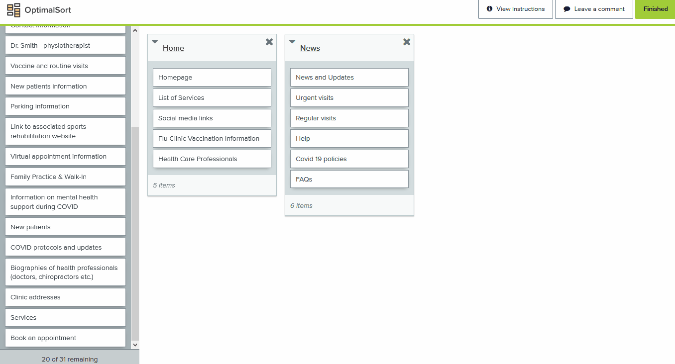
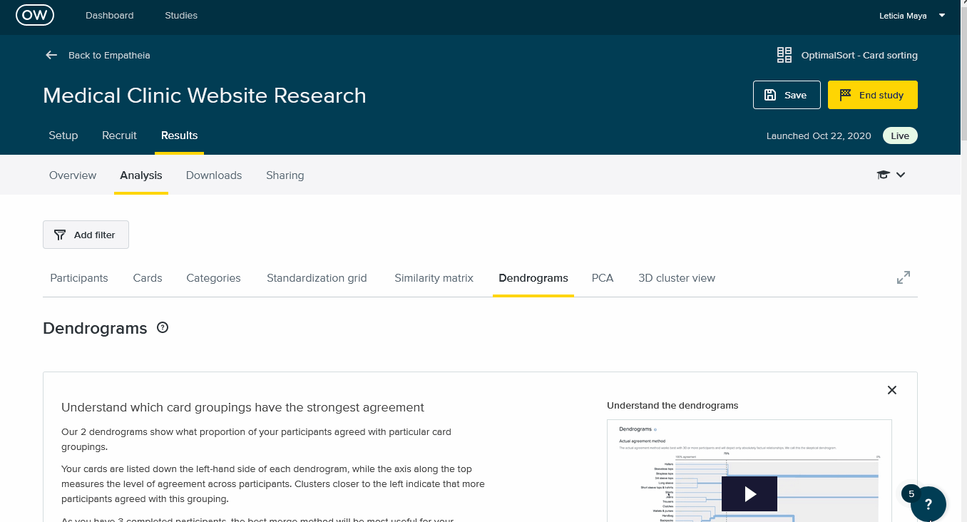
Card Sorting
- Purpose: To validate information architecture for the prototype website prior to completing the full website prototype. We used the Optimal Workshop tool to create a test where participants could organized the informaiton in a more intuitive way.
Break down the problem
Insights
Patients want to find specific information about their
medical practitioners but they want the information
to be brief and easy to find.
How might we
Develop a template page where doctor bios can be reachable, including only relevant information. Doctors can input their own information while
adhering to a character limit.
Insights
There is confusion between clinic hours, walk-in clinic hours, and the hours of individual doctors
How might we
This information should be clarified on the website and
easily accessible. A message could direct patients to
Health Myself for their doctor’s available hours. A FAQs
can be created with commonly asked questions.
Insights
Patients want to find relevant information quickly
when visiting the website.
How might we
Images should help to portray information about the
clinic. Text should include brief but meaningful content.
Important messages and updates should be prominent
and static.
Insights
Patients want to have an idea of what their
experience at the clinic will be like ahead of time.
How might we
The website outline “what to expect” when
visiting the clinic or scheduling a phone appointment.
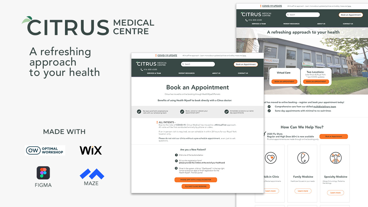
Visual Wireframes and Prototype
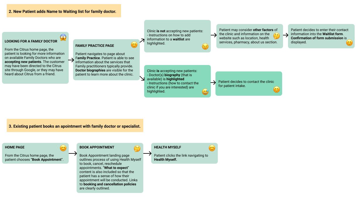
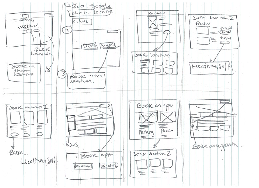
User Journey
Low Fidelity Wireframes
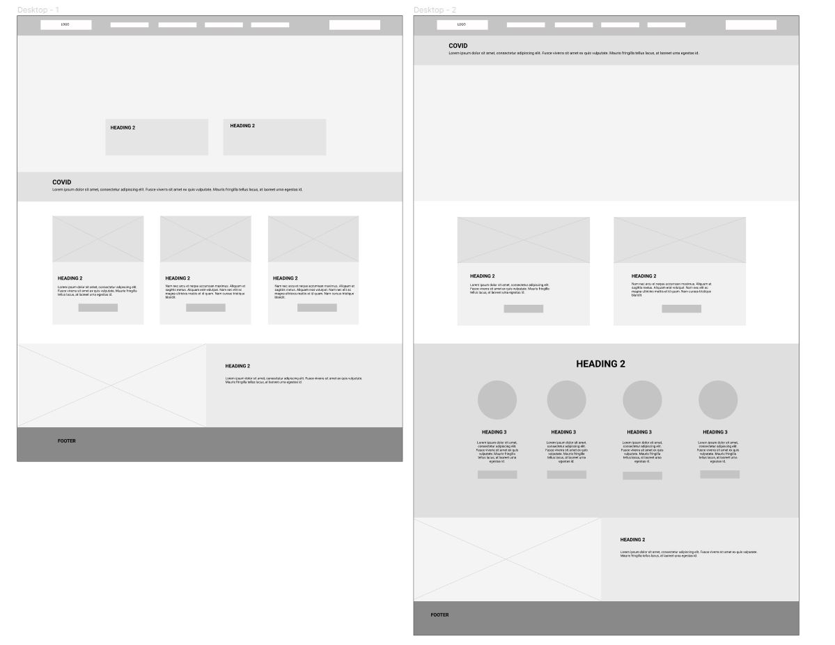
Mid Fidelity Wireframes
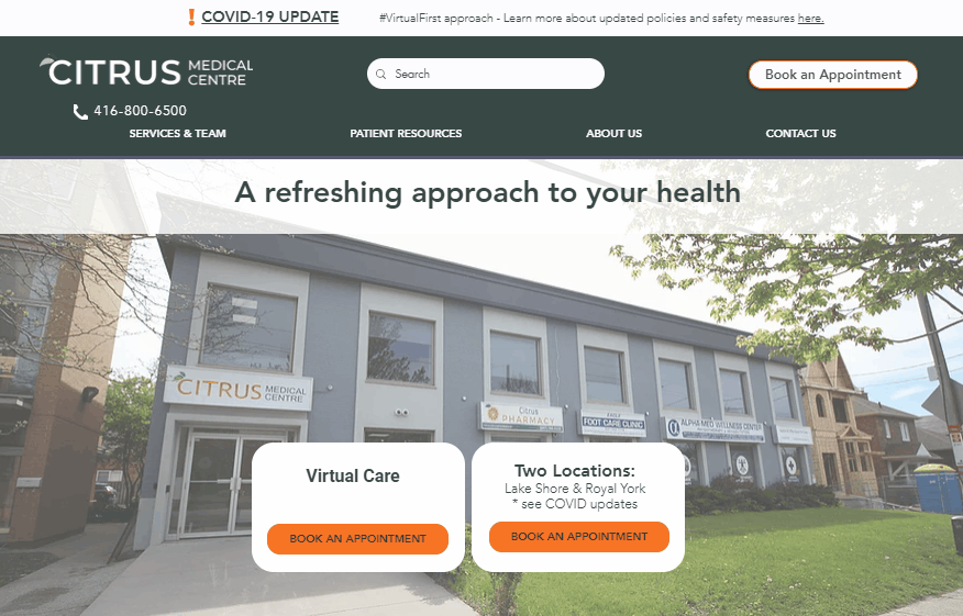
High Fidelity Wireframes / Prototype
We created the prototype in Figma, which was going to help in the usability testing. We also worked on the Wix platform. The client required a website that was going to be easy to use and updated without required of technical skills.
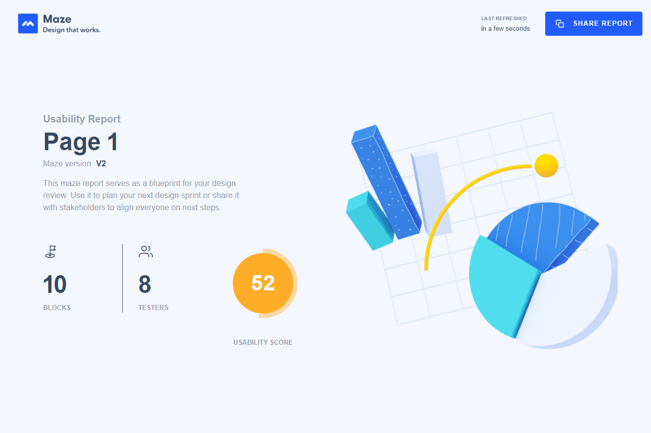
User Testing
We run three usability testing prototype versions in Maze at the end of the project. Giving us the 52 usability score.
Results
The client is reviewing the project and adding more enhancements.
This project is still in progress